What research did you
carry out and how did it inform your planning?
Firstly, I looked into the history of music promotion
videos and what their initial purpose is. I found that music videos do not just
promote a particular song, but the artist or band. Many artists do not appear
on television so music videos are a great way for their fans to see them
perform their music, while also having the opportunity to appeal to a larger
audience. They largely appeal to youth sub-cultures by reinforcing generic
elements of musical genres and by creating an image/screen persona of the
artist.
My earlier ideas were influenced in some way by the style of
the illustrated book with a song soundtrack called Young Colossus as well as
the music video for Neighbourhood #1 (Tunnels) and Laika by Arcade Fire which uses the
same technique with moving images I have featured in my own video. I conducted
feedback interviews with my audience to gather Psychographic preferences,
opinions and values which I then related to the construction of my own video.
Another main influence was the style of the video King Rat by Modest Mouse directed by Heath Ledger.
I also analysed an existing videos, creating a storyboard of screen shots to see how it was constructed and what were the most important features, styles and shots used. In a group, I also reconstructed an existing music video: “Shelter” by covered by Birdy which allowed me to experience how much planning was required before shooting as well as allowed me to get familiar with the software Premiere Pro before constructing my own video.
 The interviews I conducted provided my research and planning
with qualitative data which are not always reliable, but they are valid. This
type of data describes meaning rather than statistics. My opinion polls provided quantitative data which are more
reliable and easy to analyse and draw conclusions from. Quantitative data is
statistical – it focuses on numbers rather than meaning and experience.
The interviews I conducted provided my research and planning
with qualitative data which are not always reliable, but they are valid. This
type of data describes meaning rather than statistics. My opinion polls provided quantitative data which are more
reliable and easy to analyse and draw conclusions from. Quantitative data is
statistical – it focuses on numbers rather than meaning and experience.
Both types of data allowed me to draw demographic data
(current statistical characteristics of a population, including fields such as
gender, race, age, disability, home ownership or employment) as well as
psychographic data which is valuable in the field of marketing. Psychographic
data can be contrasted with demographic variables (such as age and gender),
behaviour variables (such as usage rate or loyalty) and organisational demographic
variable (such as industry and number of employees).
How did you use media
technologies in the construction and research, planning and evaluation stages?
During my research and planning I used a video camera to
shoot interviews and upload the audience feedback onto my blog. Adobe After
Effects and Premiere Pro were the main tools I used to produce my video while
able to take screen shots of the process using the snipping tool available on
Windows computer systems so I could show my progress in a more visual way. I
have uploaded drafts onto YouTube as a viewing format and embedded them onto my
blog as well as taking clips from YouTube as part of my research.
 In what ways does
your media product use, develop or challenge forms and conventions of real
media products?
In what ways does
your media product use, develop or challenge forms and conventions of real
media products?
When researching into existing media products, I analysed
the codes and conventions of music videos, magazine advertisements and CD
digipaks, focusing particularly on the Indie Rock genre. Indie Rock is a sub genre of alternative music, appealing to a niche audience – those who like
music to be different to the mainstream. Genre helps create a target audience
so the producers can use codes and conventions to establish what the product
is.
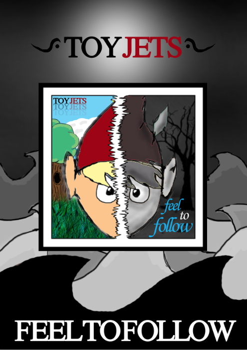
 My music video features the song “Feel to Follow” by The
Maccabees; an indie rock band from South London, England. The single is taken
from their third record: “Given to the Wild”.
My music video features the song “Feel to Follow” by The
Maccabees; an indie rock band from South London, England. The single is taken
from their third record: “Given to the Wild”.
I have adopted traditional codes and conventions such as
close-ups and fast rhythmic editing. But particular codes and conventions are
beginning to be almost ignored in this post-modern era. In 2012, for example,
Bob Dylan released a video which plays on expected clichés. The audience’s
expectations are subverted by the controversial, shocking violence.
Codes and conventions include the use of cinematography,
sound, Mise-en-scene and editing. I decided to adopt quite traditional use of
cinematography such as beginning the film with an establishing shot and
featuring close-ups, Birdseye angle and tracking.
 When considering the
Mise-en-scene, I decided to incorporate pathetic fallacy found in many films
and stories, so the beginning is sunny and colourful, but when things start to
go wrong, the scene is darkened. I thought it would be would be difficult to
consider “lighting” as a feature but the second section of the video is not all
dark for I added the flickering effect which makes the video look like there is
candlelight being reflected onto the scene, as well as giving the video an
old-fashioned tint. I have used editing features such as fade outs, reaction
shots and superimposition throughout.
When considering the
Mise-en-scene, I decided to incorporate pathetic fallacy found in many films
and stories, so the beginning is sunny and colourful, but when things start to
go wrong, the scene is darkened. I thought it would be would be difficult to
consider “lighting” as a feature but the second section of the video is not all
dark for I added the flickering effect which makes the video look like there is
candlelight being reflected onto the scene, as well as giving the video an
old-fashioned tint. I have used editing features such as fade outs, reaction
shots and superimposition throughout.


How did you attempt
to meet audience expectations in your planning?
After conducting a significant amount of audience research,
I was able to see who I would be aiming the video at and what style it should
be.
The opinion polls set at the side of my blog allowed me to
decide that an animated video including a narrative is the most popular choice.
The majority I asked reported that they prefer Alternative/Rock music – so an
animate video would fit well. I found a few examples during planning which I
could take influence from but I also observed that animation is quite a unique
technique in videos, used to compliment alternative and different songs.
When planning to produce an animated feature, I was aware of
running the risk of being either too childish or too girly. The ratio between
male and female is fairly equal, so I had to find a way to find that balance,
while still being creative and adventurous. The largest age range that took
part in my survey were in the 16-19 bracket. So I was able to design the video
to be fun and not overly sophisticated.
Animation is used in more unusual songs that appeal to a
niche audience. My target audience will be fans of the Maccabees. The Maccabees
are a vibrant band who are stylish and often seen to wear bright colours. Also
looking at the average statistics of their music videos and live performances
on YouTube, the majority of the people watching these videos are between 14 and
24 and are female. Fans of this particular kind of music will enjoy light, fun
music. Stop animation is used in their music video for ‘Latchmere’ which
presents them in a creative and young spirited way. My audience will reflect
this – they will like socialising and listening to music, and so during
planning, it was a necessity to consider audience expectations of the genre and
style, and make it fun while fitting to the theme of the song.
How does your
production relate to previous productions/examples of the same nature?
During the research process, I analysed existing videos. In
doing so, I could take inspiration and relate certain features to my own production.
I found that the feeling of the song was reflected in the video rather than the
meaning of the song which is more of a postmodern feature – style over
substance.
My ancillary texts use similar codes and conventions to
existing media texts such as the bold titles, continuous colour scheme and
simple but declarative language such as “Out Now” which is eye catching but not
distracting from the main feature. I also found that in the majority of album
advertisements, the CD cover itself is a main feature.
Discuss the technical
details of your production
I decided to illustrate my narrative briefly as a storyboard
so when it came to animating the scenes, I had the opportunity to adapt and
change to the software I was going to use. At this point I had not decided what
animation technique I was going to use which is why conducted extensive
research into different types of animation including 2D, computer assisted 2D,
3D, stop motion, flash, after effects, plasticine and sand animation.
Each image I drew in the storyboard was like a key frame in
the video, a point where a scene changes or a different character is
introduced. I originally planned to use stop animation which consisted of
hundreds of photos compressed into one film. I hand-drew some of my characters
and settings but realised I would much more flexibility if I were to animate
them digitally – this was also a better decision for me because I planned on
having a simple narrative where one character experiences lots of strange
places and meets strange characters which were ideas heavily influenced by the
Mighty Boosh – an abstract, post-modern television show which appeals to my
target market.
Deciding on this particular influence early on in the planning stage allowed me to plan the video without the mind-set of ‘it has to make sense’. I was able to create an alternative reality within the video and play on the idea that the audience doesn't know what is coming next. I liked the idea of producing quite a psychedelic story – in style and narrative with an abstract/hallucinogenic nature. So I had to decide on what type of animation technique would be able to adopt and develop my initial ideas.
I created my initial in Photoshop after deciding to change my idea from stop animation to after effects. Using a graphic tablet, I was able to develop and experiment with different colours and images.

 The grass effect was created with the paint brush tool and
various shades of green – this was a much better result for I had previously
coloured a layer in green which did not look effective. I found that the detail
in each image was extremely important for some simple shapes like the sun would
look dull if something as simple as the grass did not look complete. I like the
contrast between the detail here and the simplicity of the surroundings. I
researched into older cartoons to look in particular at the setting. Danger
mouse, for example, has detailed characters and some settings have detailed
elements that make the shot look much more effective, however the backgrounds
are plain which helps draw more attention to the storyline. My opening shot is
an establishing shot so having elements such as the tree and the grass very
detailed gives a more realistic approach.
The grass effect was created with the paint brush tool and
various shades of green – this was a much better result for I had previously
coloured a layer in green which did not look effective. I found that the detail
in each image was extremely important for some simple shapes like the sun would
look dull if something as simple as the grass did not look complete. I like the
contrast between the detail here and the simplicity of the surroundings. I
researched into older cartoons to look in particular at the setting. Danger
mouse, for example, has detailed characters and some settings have detailed
elements that make the shot look much more effective, however the backgrounds
are plain which helps draw more attention to the storyline. My opening shot is
an establishing shot so having elements such as the tree and the grass very
detailed gives a more realistic approach.
Each element in this frame have been drawn as individual images
and then compiled into one setting, allowing layers to move individually. When
I was satisfied with the final design of my main character, I duplicated him so
I could make different facial expressions he could use throughout the video
which would help with the emotions I have tried to convey.
The opening section of the film is very happy and relaxed
but I thought that if he had a constant smile, it would look less realistic and
there would be no point in certain shots such as where he looks up, smiles and
waves at the sun. However, if he had a straight face, he would look miserable.
So I decided that if he has no mouth to begin with, it will provide more
flexibility to play with different emotions and it will look more significant
when he smiles or looks shocked – something as small a detail as the mouth of
the character created a heavy problem for me but I was able to make the
decision to remove the mouth all together at certain points because the video
is unusual and weird anyway which was its original purpose.
 I also wanted the
video to become quite dark so if he had a constant smile to begin with, he
would then have to have a constant sad face which would make the character look
constantly stationary and unemotional while giving the feeling he is being
puller around everywhere but has no emotions other than sadness. Whereas I
wanted him and the audience to keep being surprised as to what was going to
come next, so it was clear when something drastic would happen – it wholly adds
to the drama and suspense of the video.
I also wanted the
video to become quite dark so if he had a constant smile to begin with, he
would then have to have a constant sad face which would make the character look
constantly stationary and unemotional while giving the feeling he is being
puller around everywhere but has no emotions other than sadness. Whereas I
wanted him and the audience to keep being surprised as to what was going to
come next, so it was clear when something drastic would happen – it wholly adds
to the drama and suspense of the video.

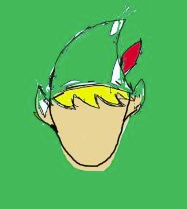
The overall image of the character is an inter-textual link
to Disney’s Peter Pan.
 Whereas the part where he is falling down the hole and
into a whirlwind/vortex is an inter-textual reference to the rabbit hole in
Alice in Wonderland. This effect was created with a blurred paint brush tool,
experimenting with different colours to achieve a psychedelic visual affect. I
then used the editing program to place the main character over this background
to get him to spin and shrink at the same time as if we are looking down on him
on a Birdseye angle while he falls further and further down the hole.
Whereas the part where he is falling down the hole and
into a whirlwind/vortex is an inter-textual reference to the rabbit hole in
Alice in Wonderland. This effect was created with a blurred paint brush tool,
experimenting with different colours to achieve a psychedelic visual affect. I
then used the editing program to place the main character over this background
to get him to spin and shrink at the same time as if we are looking down on him
on a Birdseye angle while he falls further and further down the hole.

This is the point where it is almost like a nightmare and
everything becomes black, white and grey. I wanted this section to look very
dark but I was aware that there was a risk of making the video look dull. But
using different shades of these limited colours created complimenting textures,
making the images look much more visually interesting.
Another challenge was to make my character swim. I originally planned for him to walk along the sea bed but to experiment with different ways I could get him to move around.

Another challenge was to make my character swim. I originally planned for him to walk along the sea bed but to experiment with different ways I could get him to move around.

 I found it difficult to construct certain backgrounds, such
as getting the bar trees to look 3D, and more like an old horror film. So I
drew a faint line to split the ground and the sky and changed the opacity of
the brush to give the images different tones. I found a lead shape on the pain
brush tool in Photoshop and varied the size of the brush to give the illusion
the leaves have just fallen from the now-bare trees. I then pasted an image of
a bare tree, taken from Google images onto a new layer and went over it with an
extremely fine brush in another layer so I could get rid of the original image
once I had got the skeleton shape of the tree, and then develop it in the way I
wanted it to look. I did this technique three times with three different
outlines and make them various sizes to create the feel that they are heading
back into the distance.
I found it difficult to construct certain backgrounds, such
as getting the bar trees to look 3D, and more like an old horror film. So I
drew a faint line to split the ground and the sky and changed the opacity of
the brush to give the images different tones. I found a lead shape on the pain
brush tool in Photoshop and varied the size of the brush to give the illusion
the leaves have just fallen from the now-bare trees. I then pasted an image of
a bare tree, taken from Google images onto a new layer and went over it with an
extremely fine brush in another layer so I could get rid of the original image
once I had got the skeleton shape of the tree, and then develop it in the way I
wanted it to look. I did this technique three times with three different
outlines and make them various sizes to create the feel that they are heading
back into the distance.

When drawing the sun, I realised it looked very plain
compared to other features of the scene, so I drew two different sets of sun
rays so they could alternate between one another when animated in After
Effects.
 I decided to outline the sun because it blended in too well with the
light blue background.
I decided to outline the sun because it blended in too well with the
light blue background.

One of the most challenging aspects to design was the wave
pattern. This idea was heavily influenced from a scene in Arcade Fire’s
‘Neighbourhood #1 (Tunnels)’ I had to draw each set of waves in individual
layers, trying to keep the same sort of shape using the graphic tablet which I
found to be difficult as well as time consuming. To create the illusion of the
waves moving while looking like they are getting further away into the
distance, I have drawn the waves smaller with an increasing number of peaks
each time on a new layer. I was satisfied with the outcome and thought this was
one of the most realistic shots of the video. Once I had completed all my
images, I imported them onto the After Effects program. This piece of software
allowed me to resize, rotate and move images on different layers at the same
time by creating multiple key frames at certain points. A technique I learned
to do on this program was the ‘flickering effect’ which appears when the scene
becomes dark and there is a close-up of his face. To do this, I inserted a
solid black layer above the video layer. Then in the ‘video effects’ option, I
changed the opacity to alternate between 30% and 40%. Changing the opacity of
the black layer makes the video look like it is getting brighter and darker.
Having an uneven space between each key frame is what provides the more
realistic flickering effect, rather than constantly getting higher and darker
at the same speed simultaneously.
I burned the edges of the image to frame the video and make
that beginning look like a dreamland, whereas it eventually becomes looking
more like a nightmare. To do this, I created a circle using the video effects/generate
tool and adjusted the ratio which changes the size of the shape. Feathering the
layer blends the circle into the image to make it look more subtle. I inverted
the circle so inside was blank and then changed the blending mode to normal.
When the scene darkens, I edited the circle to give the image a black edge.
The video begins with a fade in and an establishing shot to
give the narrative a context - the first use of animation in the clouds.
 I drew
the full scene in Photoshop with each item on each individual layer so they
could move individualistically. The clouds move subtly while the shot zooms in
slowly to fit with the relaxed, serene feeling of the song at this point. To
give the illusion that my character is walking, I have made numerous key frames
so he moves up and down while the setting moves horizontally. The setting is
the same shot as the first but extremely zoomed into the blades of grass to
show the proportions.
I drew
the full scene in Photoshop with each item on each individual layer so they
could move individualistically. The clouds move subtly while the shot zooms in
slowly to fit with the relaxed, serene feeling of the song at this point. To
give the illusion that my character is walking, I have made numerous key frames
so he moves up and down while the setting moves horizontally. The setting is
the same shot as the first but extremely zoomed into the blades of grass to
show the proportions.

To get his arm to wave independently from his body, I had to
carefully split each section of his body into layers so I could choose which
section I was going to animate. In the falling scene, I rotated the subject and
placed key frames every 90 degrees. The problem I was faced with at this point
was trying to make him look smaller to give the illusion he was falling down a
hole. Making the image smaller also pulled each of his features down with his
feet to the bottom of the page, almost like an anchor. So I had to add more key
frames to make him rise in the shot, even though I is not clear when put in
front of the chaotic, swirling background.
 To animate my video, I used the Adobe After Effects CS5
program – a digital motion graphics and computing software package published by
Adobe Systems, often used in the post-production process of film-making and
television production. Its main uses are the origination of 2D and 2.5D
animation and visual effects.
To animate my video, I used the Adobe After Effects CS5
program – a digital motion graphics and computing software package published by
Adobe Systems, often used in the post-production process of film-making and
television production. Its main uses are the origination of 2D and 2.5D
animation and visual effects. After creating short scenes in After Effects, I gradually
compiled them into Adobe Premiere Pro which is a timeline-based video editing
software application. It is the Adobe Creative Suite, a suite of graphic
design, video editing and web development programs. Although I had only briefly
used this software in an AS to A2 transition project, I found that the
interface and tools were familiar because of synergy to other Adobe products
like Photoshop that I had used in my Foundation Portfolio. Adobe Premiere Pro
allowed me to digitally manipulate my video material in a flexible and
technically sophisticated manner
After creating short scenes in After Effects, I gradually
compiled them into Adobe Premiere Pro which is a timeline-based video editing
software application. It is the Adobe Creative Suite, a suite of graphic
design, video editing and web development programs. Although I had only briefly
used this software in an AS to A2 transition project, I found that the
interface and tools were familiar because of synergy to other Adobe products
like Photoshop that I had used in my Foundation Portfolio. Adobe Premiere Pro
allowed me to digitally manipulate my video material in a flexible and
technically sophisticated manner The making of my digipak, on the other hand, was done in
Photoshop. I liked the idea of splitting two images to make one, so I
originally took two shots from my video (one in colour and one in black and
white). I also had the idea of just choosing one of them to feature on the
cover and one on the back because, when researching CD digipaks, there is
always a sense of continuity, coherence and a relationship between the specific
images chosen. I was working with the images I had taken screen shots of when I
realised I could go back to my original images I produced in Photoshop and
position them in a different way to adapt them to the album cover. Previously,
I had produced the exact same image of the character in two contrasting styles
so the idea of using both to create such a disparity was a design which could
be done in several ways, rather than keeping it simple and residing to one
image which could potentially be more interesting. However, this concept did
create much more of a challenge.
The making of my digipak, on the other hand, was done in
Photoshop. I liked the idea of splitting two images to make one, so I
originally took two shots from my video (one in colour and one in black and
white). I also had the idea of just choosing one of them to feature on the
cover and one on the back because, when researching CD digipaks, there is
always a sense of continuity, coherence and a relationship between the specific
images chosen. I was working with the images I had taken screen shots of when I
realised I could go back to my original images I produced in Photoshop and
position them in a different way to adapt them to the album cover. Previously,
I had produced the exact same image of the character in two contrasting styles
so the idea of using both to create such a disparity was a design which could
be done in several ways, rather than keeping it simple and residing to one
image which could potentially be more interesting. However, this concept did
create much more of a challenge.
I began by drawing a jagged line down the centre of the page
with a very think, horizontal paint brush. Then, using the blending options, I
created an outline to make the shape more definite. I added two separate
borders to frame and enhance the images. The first image I added onto a new layer
was a close-up of the black and white character. I placed the head in the
centre of the frame so the line would run directly down the middle of the face.
I then positioned the other colour image over this one and
used the eraser tool on full opacity to remove one side of the face. I used the
same technique to add to the backgrounds – this just meant rearranging the
layers on Photoshop so the main subject lays on top of the background instead
of the other way round.
 I designed the band name and format with colour contrast to
hit with the split cover. I duplicated the text and positioned it underneath
with a lighter opacity rate. I did this again to make it look like it is fading
away. I found this a nicer technique than changing the blending options of the
text. When researching, I found the name of the band or artist is normally
presented more subtly than the name of the album. I then added the text ‘feel
to follow’ after the single of the album. I changed the font and colour to
create a contrast and make the album as a whole an independent product for the
style of the band name can be the same on all their future products but the
style of the album name will always change. I felt this font in particular
fitted with the chilled out style of music.
I designed the band name and format with colour contrast to
hit with the split cover. I duplicated the text and positioned it underneath
with a lighter opacity rate. I did this again to make it look like it is fading
away. I found this a nicer technique than changing the blending options of the
text. When researching, I found the name of the band or artist is normally
presented more subtly than the name of the album. I then added the text ‘feel
to follow’ after the single of the album. I changed the font and colour to
create a contrast and make the album as a whole an independent product for the
style of the band name can be the same on all their future products but the
style of the album name will always change. I felt this font in particular
fitted with the chilled out style of music.
When constructing the magazine advert, I decided to use a
setting from my video as the backdrop – bearing in mind the continuity of my
products. The colour scheme of the majority of my video is in shades of black,
white and grey. So when producing the digipak, I did not want to disregard this
decision I had thought about so early on in the production of my portfolio.
However, I had to adapt the image for my advert for it was originally a
landscape setting for a scene in my animated music video so I had to position
each layer in a way which would not distract from the main feature of the
advertisement, yet still look effective. I used the eraser tool in Photoshop
with a low flow rate to produce the hazy moon effect. Having the position of
the moon in centre frame would look unnatural and unrealistic whereas having it
to one side would unbalance the layout of the page so finding that equilibrium
was a matter I had not seen to be potentially problematic when I planned the
design of management advertisement.
I pulled the jpg file of the CD front cover onto a new
layer. Having the cover of the album appear on the advert is an important
factor I have gathered from my research into this field. I enlarged and centred
the image to make it a prominent feature.
Next, I added the title of the band. There must be a clear
distinction between the band name and the album title. The band name usually
has its own separable font and format to the album name. so the font and colour
scheme chosen for the band name on the album cover is the same as the title on
the magazine advert. Having one word in black and one in colour relates to the
chosen layout of the album cover with a definite between two sets.
 The sign next to the title has been drawn free-hand with a
fine paint brush in Photoshop, then duplicated and flipped the layer to have
the design on either side of the band name. I added this feature to make the
text stand out even more and could also be used later in other productions,
almost like an iconic logo for the band.
The sign next to the title has been drawn free-hand with a
fine paint brush in Photoshop, then duplicated and flipped the layer to have
the design on either side of the band name. I added this feature to make the
text stand out even more and could also be used later in other productions,
almost like an iconic logo for the band.
The title of the album is in bold and capitals, different to
how it is presented on the album cover. This decision was down to the fact that
the white contrasts perfectly with black and is therefore more dynamic.
Having the text ‘out now’ in capitals is a common trait when
advertising a product which is new on the market. This is done so people are
aware that it has already been released and available to purchase. I added an
inner shadow and outer glow to give the texts some texture so it is less plain.
The light blue colour of the written text relates to the title of the album on
the album cover.
How effective is the
combination of your main product and ancillary texts?
When planning and producing my ancillary texts, I had to
consider my music video and what style I have used for when researching into
existing magazine advertisements and album covers, it is clear that an element
of continuity is involved so I had to find a way to make each text relate to
one another. I have managed to incorporate the main character from the video
into my ancillary texts which makes the character itself quite iconic and could
be used on the artist’s further productions.
Audience Feedback
What does your
audience think of your product?
When reviewing my product, I conducted a series of
interviews with my target audience to see what they thought. The common opinion
was that they thought it was definitely unique and pushed the boundaries.
Some of the main strengths that were pointed out were the
type of narrative and the subtle twists involved. The distinctive scenarios and
the character develop well throughout the video. The style of the images and
the distinct simplicity was taken well and the build-up of music goes with the
actions involved. Particular subtleties were noticed by my audience such as the butterfly from the beginning becomes a prominent part of the story line.
If I had more time, I could have illustrated the characters
in multiple ways, instead of just faced front on. I would have liked to make
the limbs work individual to make the walking scenes look more realistic as
well as a wider variety of facial expressions.
I have learned from the audience feedback what could be
improved and what the main strengths of the video are. By gaining feedback from my target audience,
I was then able see how the industry would respond to my productions. My video
has certain postmodern features (previously stated). Modern music videos are
another way for artist to push the boundaries and be different with their work
so I tried to make a video which was not generic so it would fit well in the
current industry. Having a fun and unique video will attract attention and
therefore promote the band, not just the song because people will want to
research into the musicians’ other work.
For my foundation portfolio, I created a front page, contents and double page spread of a new weekly-released music magazine using original text and images produced by myself. I decided to use the ‘rock’ genre for my magazine; however I realised that it can be divided into many sub-genres: punk, heavy metal, grunge, psychedelic rock, new wave, brit invasion, folk rock, hard rock, pop rock, southern rock and prog rock. I chose to focus primarily on glitter/glam rock using influences such as Manic Street Preachers, Marilyn Manson, Alice Cooper, David Bowie, Iggy Pop, KISS, New York Dolls, Queen, Roxy Music, and The Velvet Underground. My target market was in the age bracket of 16-25 and within the social grades of ABC1C2 for the younger generation could coincide with the genre of ‘Glam Rock’ as well as having money to spend on luxuries like a weekly magazine. In this day and age, music is as much to do with image as it is with music. The way a band or artist looks and behaves on stage effects how their music is perceived – I think their attitudes are inspirational for many young people who follow this particular fashion or want to break into the music industry. The people who read music magazines are those passionate about music, constantly looking for new artists and regularly appear at live music events.
For my foundation portfolio, I created a front page, contents and double page spread of a new weekly-released music magazine using original text and images produced by myself. I decided to use the ‘rock’ genre for my magazine; however I realised that it can be divided into many sub-genres: punk, heavy metal, grunge, psychedelic rock, new wave, brit invasion, folk rock, hard rock, pop rock, southern rock and prog rock. I chose to focus primarily on glitter/glam rock using influences such as Manic Street Preachers, Marilyn Manson, Alice Cooper, David Bowie, Iggy Pop, KISS, New York Dolls, Queen, Roxy Music, and The Velvet Underground. My target market was in the age bracket of 16-25 and within the social grades of ABC1C2 for the younger generation could coincide with the genre of ‘Glam Rock’ as well as having money to spend on luxuries like a weekly magazine. In this day and age, music is as much to do with image as it is with music. The way a band or artist looks and behaves on stage effects how their music is perceived – I think their attitudes are inspirational for many young people who follow this particular fashion or want to break into the music industry. The people who read music magazines are those passionate about music, constantly looking for new artists and regularly appear at live music events.
Over the course of the first year, I have gained and developed knowledge and skills when it comes to production work, in particular using Photoshop. Before I started the Media course, I had no familiarity with Photoshop and the tools required to make a successful media product for instance media language and terminology.
Beginning my learning by creating a draft of a college magazine’s front cover and contents page provided the opportunity to learn about the software needed in such areas, Photoshop, for example, and the various techniques which I could then apply to my music magazine. The ‘blogger’ system was also an unfamiliar programme I had not used before. I found that it is not only advantageous for my coursework, but for anyone wanting to publicise something. Living in this short-attention span global society, everything is digital and consumed at an incredible rate. When researching and planning my final product, I was made of aware of all the different institutions and how each worked for example I had not heard of many of the existing music magazines available until I had to look at all ranges of genres and analyse them. This is when I realised how each organisation uses the same type of conventions to persuade the reader to buy them and publicise their product on the market.
When using Photoshop, I decided to experiment more with the tools provided to try and make my work more unique and professional-looking. I researched into how to airbrush a subject’s skin as well as use the ‘burn’ tool to enhance the colours in certain areas such as the eye and lip makeup and around the edges of the entire page as a way of framing the image. When developing my product, I changed my mind about small things such as the colour and font of the title, where I would often change the blending options like the inner and outer glow. To get the mirrored effect of the title, I simply duplicated the title layer and inverted it, then used the eraser tool to gradually delete the bottom half of the text. The rest of the text on the page features the drop shadow tool in order to stand out and the barcode was produced on an online barcode generator. For the double-page spread and contents page images, I adjusted the brightness/contrast, colour balance, exposure and channel mixer. I added blue highlights to her hair to fit the genre more using the brush tool. I had to change the opacity of the brush throughout to make some areas look richer in colour than others.
When comparing my college magazine to my music magazine, it is clear that the early drafts have many blemishes. The page seems quite plain and empty, with no splash or puff to attract the reader. The house style only consists of two colours; green and purple which are not as eye-catching and attractive as three colours in the colour scheme for the music magazine. The final cover of my music magazine is very different to the earlier drafts – this is mainly due to the feedback and advice I have received which has helped me cultivate my abilities and ideas as well as giving me the confidence to be more creative and original in my work. My contents page was not as informative or as interesting as existing ones. It lacks many features and those which are present look odd because they are unevenly spaced. I have learnt that the layout and organisation of the magazine is incredibly important and I think it is visibly clear that my technological skills have progressed throughout the making of the final product.
In conclusion, my understanding of the production, layout and overall view of the media world has improved a great deal over the course of the first year. The feedback, thoughts and ideas I have received have helped me massively with the development of my learning and final outcome because I think that I would not have learned so much if mistakes were not made initially. I feel I have improved on all aspects of the task given (digital technology, creativity, research and planning, post-production and using conventions of a real media text). For example, the college magazine contents page is very plain with a lot of wasted space – I learnt from producing this what elements need to be improved by simply equating it to a professional contents page already on the market which is how we began the project – by researching into already existing magazines and creating a LIIAR analysis of each, be it a classical, R&B or alternative magazine. Each magazine is aimed at a different target market but I found that they all use the conventions and codes of a music magazine and rarely deviate from the rules.


